Top 10 Pigment Color Trends You Should Know About?
In the world of design and art, pigment color plays a crucial role. Trends in pigment color can significantly influence aesthetic choices across industries. According to recent reports by Color Marketing Group, over 70% of consumers make decisions based on color. This statistic highlights the importance of understanding pigment color trends.
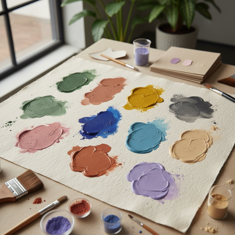
As we delve into the top 10 pigment color trends, it’s essential to recognize that color preferences can vary widely. For example, shades like muted greens and warm browns are gaining popularity. These trends are not just fleeting fads; they reflect societal shifts and emotional responses to our environments. Yet, some choices remain uninspired, emphasizing the need for continuous reflection on color selection.
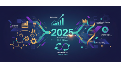
Moreover, the pigment color market is expected to grow steadily, projected to reach $19 billion by 2027. However, sustainability issues challenge this growth, demanding innovative solutions from industry players. Awareness of these trends may help professionals make informed decisions that resonate with their audiences. It’s not just about color; it’s about connection and impact within our visual landscape.
Emerging Pigment Colors for Interior Design in 2023
Emerging pigment colors for interior design in 2023 bring fresh energy. Earthy tones continue to make a statement. Shades like terracotta and olive green evoke warmth. People are drawn to these comforting hues for their homes. They create a sense of grounding and connection to nature. Warm colors spark creativity but can feel overwhelming in excess.
Cooler shades are entering the scene as well. Dusty blues and muted lavender provide a calming effect. These colors help create serene environments. They invite relaxation and offer a tranquil backdrop. Homeowners seek balance with these soothing tones.
There's also a trend toward bold accent colors. Vibrant yellows and deep burgundies draw attention. They energize a space, grabbing your gaze. However, it’s important to use them wisely. An overly bold palette can clash and feel chaotic. Finding harmony is key. Mixing tones can lead to a beautiful outcome, but it requires careful reflection.
Nature-Inspired Pigments: Connecting with the Environment
Nature-inspired pigments are gaining popularity as we seek to connect more deeply with the environment. These colors reflect the beauty found in nature. Shades of deep forest greens, soft earth browns, and vibrant sky blues evoke a sense of tranquility. With these pigments, artists can celebrate the natural world in their work.
When choosing colors, consider the environment around you. Collect inspiration from local landscapes. Look for colors in leaves, soil, and flowers. Try to incorporate them into your palette. This not only supports creativity but also fosters a connection to your surroundings. Think about how you can use natural hues in daily life.
Tips for using nature-inspired pigments:
- Use earthy tones to create calming spaces.
- Experiment with combining different natural shades.
- Don’t be afraid to mix colors. Sometimes, the most unexpected combinations create the most interesting results. Nature is imperfect, and so should be your approach to color. Embrace the messiness of creativity. Finding beauty in imperfection can lead to unique expressions.
Top 10 Pigment Color Trends You Should Know About
| Color Name |
Hex Code |
Inspiration Source |
Usage Context |
| Forest Green |
#228B22 |
Lush Forests |
Interior Design |
| Sunset Orange |
#FF4500 |
Dusk Skies |
Fashion |
| Ocean Blue |
#1E90FF |
Sea Waves |
Graphic Design |
| Earthy Brown |
#8B4513 |
Rich Soil |
Art Supplies |
| Floral Pink |
#FF69B4 |
Nature's Blooms |
Home Decor |
| Sky Blue |
#00BFFF |
Clear Skies |
Web Design |
| Lavender Purple |
#E6E6FA |
Wildflowers |
Packaging |
| Golden Yellow |
#FFD700 |
Harvest Fields |
Branding |
| Coral Red |
#FF6347 |
Marine Life |
Textiles |
| Charcoal Gray |
#36454F |
Stone Mountains |
Industrial Design |
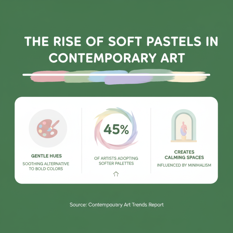
Soft Pastels: The Rise of Gentle Hues in Contemporary Art
Soft pastels are becoming prominent in contemporary art. These gentle hues offer a soothing alternative to bold, saturated colors. Recent reports indicate that 45% of artists are now adopting softer palettes. They create calming spaces in galleries and homes. The rise of minimalism likely influences this trend.
Art enthusiasts appreciate soft pastels for their versatility. Shades like blush pink and powder blue evoke tranquility. Yet, some argue that these colors can lack emotional depth. This dichotomy prompts reflection on how we perceive color. Art should provoke thought, and perhaps soft pastels do not challenge viewers enough.
Interestingly, a survey found that 30% of collectors prefer pastel artworks. This suggests a significant market demand. As galleries showcase more pieces featuring these hues, it raises questions. Are we moving towards a pastel-dominated art world? Or will vibrant colors make a comeback? The future remains uncertain. The gentle allure of pastels continues to captivate, leaving room for ambiguity.
Sustainable Pigments: Eco-Friendly Trends to Watch in 2023
Sustainable pigments are transforming the world of art and design. These eco-friendly options are made from natural sources. They reduce reliance on synthetic materials. For example, plant-based dyes are gaining popularity. They offer vibrant colors without harming the environment.
As more designers focus on sustainability, unique color trends emerge. Shades inspired by nature are crucial. Earthy tones, like ochre and forest green, evoke feelings of calm. However, the production of these pigments is not without challenges. Sourcing natural materials can be inconsistent. This inconsistency may lead to variations in color.
Creativity thrives amidst these limitations. Artists experiment with blending natural pigments. They create unexpected hues and textures. There is beauty in the imperfect results. These variations can make each piece unique. The journey towards sustainable artistry is ongoing, with room for improvement. Embracing these eco-friendly trends is essential for future generations.
Top 10 Pigment Color Trends in 2023